Developer Tools●●Solid
SQL Crack – Local-first SQL visualizer with column lineage
Column lineage tracing through joins and aggregations—execution flow visualization done well.
Eye CandySolve My Problem
buva
113mo ago
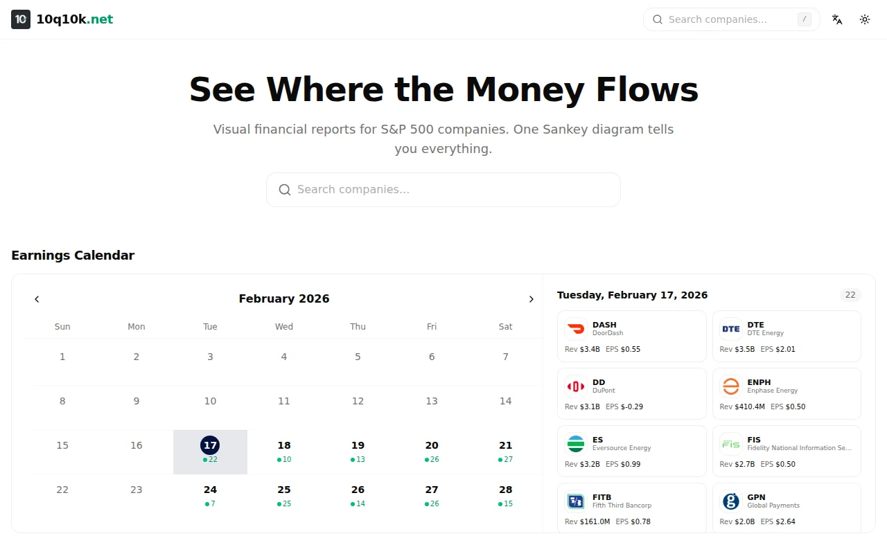
Pretty Sankey diagrams for stock research, but financial dashboards already exist everywhere.
Individual investors, financial analysts, retail traders
Bloomberg Terminal · Yahoo Finance · Seeking Alpha
Column lineage tracing through joins and aggregations—execution flow visualization done well.
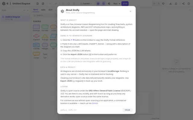
React Flow canvas with multi-model AI, but Excalidraw, Miro, and Obsidian already own this space.
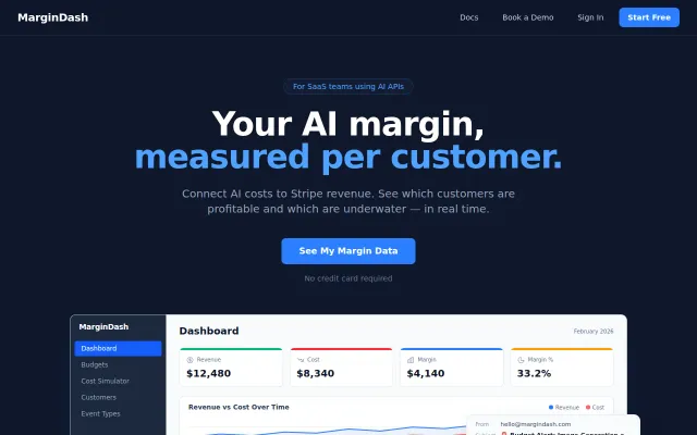
Plugs the gap between Stripe and OpenAI bills—finally see which customers are actually profitable.
LZ-compressed URLs encode entire diagrams — no backend needed for sharing.
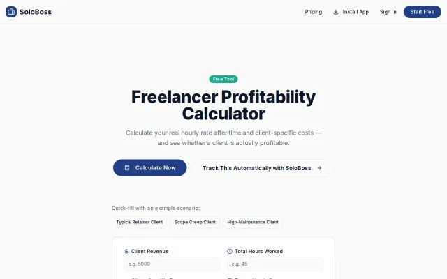
Basic calculator when spreadsheets already handle this calculation freely.
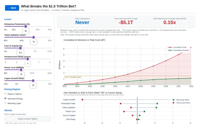
Stress-test the AI capex bubble with six adjustable levers and five economic shock scenarios.