Design●Mid
Japanese ma is the most underrated design system in front end
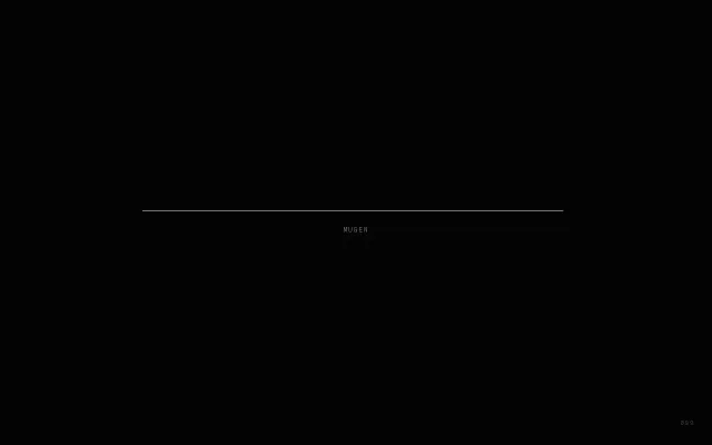
The visual concept is strong: generous negative space, a micro-typographic centerline and restrained UI that actually sells the idea of 'ma'. Unfortunately the page reads like a demo/theme — repeated copy blocks and zeroed stats suggest placeholder content rather than a finished system or component library. Useful as a quiet starting point for designers who like minimalism, but it needs real docs, components and examples to move beyond a pretty landing.
Eye CandyNiche Gem
Dontizi
204mo ago