Developer Tools●●Solid
GraphGPU – Force-directed graph visualization in WebGPU (not WebGL)
WebGPU force-directed graphs, but Sigma.js, Cytoscape, and D3 already dominate this space.
WizardryNiche Gem
yaniszaf
604mo ago
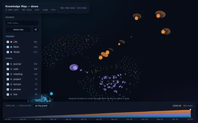
Visualize and analyze complete Git commit histories as animated force-directed graphs. See how commit density, branch activity, and contributor participation evolve over time.
Commits as force graphs over time. Hypnotic but missing actual insights: why branches diverge, merge velocity.
Open source maintainers and repository historians
Gource · GitHub Contribution Graph · GitKraken timeline view
Live site: https://nshcr.github.io/git-commits-threadline/
This project helps you quickly inspect:
- repository growth over long time ranges
- branch structure and active thread distribution
- contribution patterns across maintainers and collaborators
WebGPU force-directed graphs, but Sigma.js, Cytoscape, and D3 already dominate this space.
Pretty visualization but YouTube discovery is already solved by the platform itself.
Timeline scrubbing shows your knowledge graph grow, unlike Obsidian's static view.
Sapling's smartlog for Git: drag commits to rebase, click to split, see what happens.
Animated Git simulator showing file movements between working tree, staging, and HEAD.
Git-based context switching tracker, but time estimates rely on unvalidated research assumptions.