Health●Mid
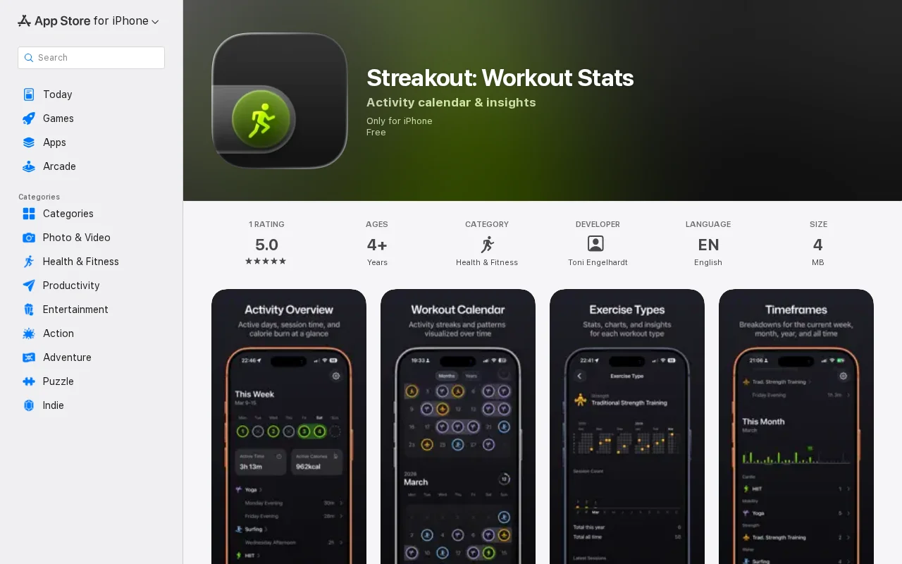
Minimalistic workout tracker for iPhone – Stats, Trends, Streaks
Apple Health visualizer with beautiful UI, but existing apps (Healthkit, Cardiogram) already do this.
CozyEye Candy
toni88x
423mo ago
Clean HealthKit viewer focusing on streaks and calendar heatmaps without subscription clutter.
iOS users tracking workouts via Apple Health who want simpler stats
SmartGym · HealthFit · Apple Fitness
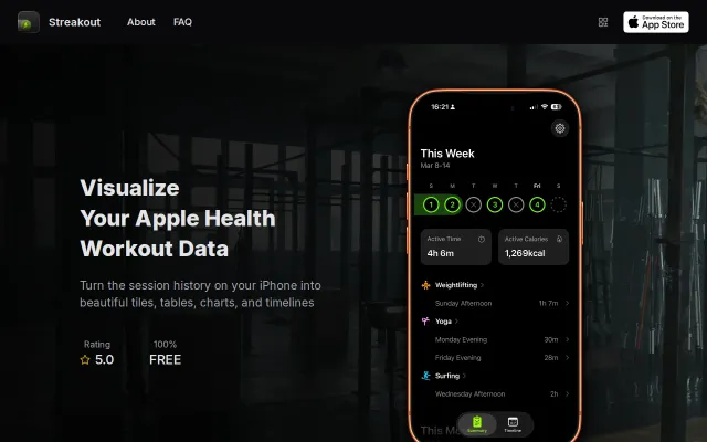
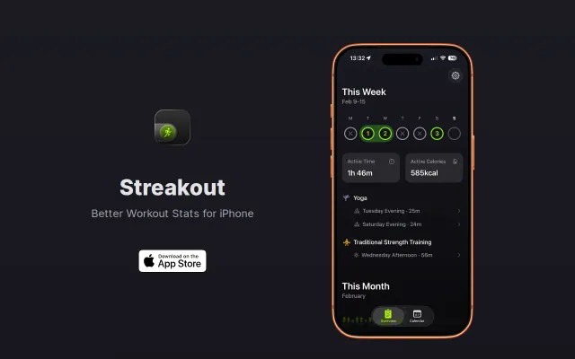
The idea is to focus on a clean, minimalistic design and only show high-level metrics that are actually useful, e.g. how often did I work out this week/month/year, cardio vs strength vs mobility, surf session count in February, etc.
It's free and offline. Also, no signup, no ads, no data sharing, no social feeds, and no notifications.
Just open it and get a quick glance at the state of your workout game within 2s.
It's built in native Swift with liquid glass.
Feedback is quite good so far, but it seems hard to get initial traction in the App Store, especially with all the AI slob these days. Would deeply appreciate some early downloads and honest reviews.
Apple Health visualizer with beautiful UI, but existing apps (Healthkit, Cardiogram) already do this.
Clean Apple Health viewer, but HealthFit and SmartGym already do this.
Real-time PyPI trends with Claude AI summaries, but analytics dashboards exist (npm trends, libraries.io).
Polished fitness app hit $1K sales via organic press, but pedometer market is saturated.
No-code fitness app, but Fitbod and Fitness+ already own this category.
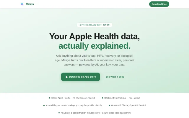
Apple Health AI advisor with BYOK—no subscription, your key, your data.