Data●●Solid
Newsmaps.io a map of how news topics are covered by different countries
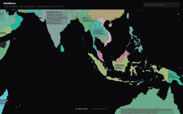
World map of 13k headlines lets you browse news by country instead of feed.
Eye CandyRabbit Hole
mkoh
1963mo ago
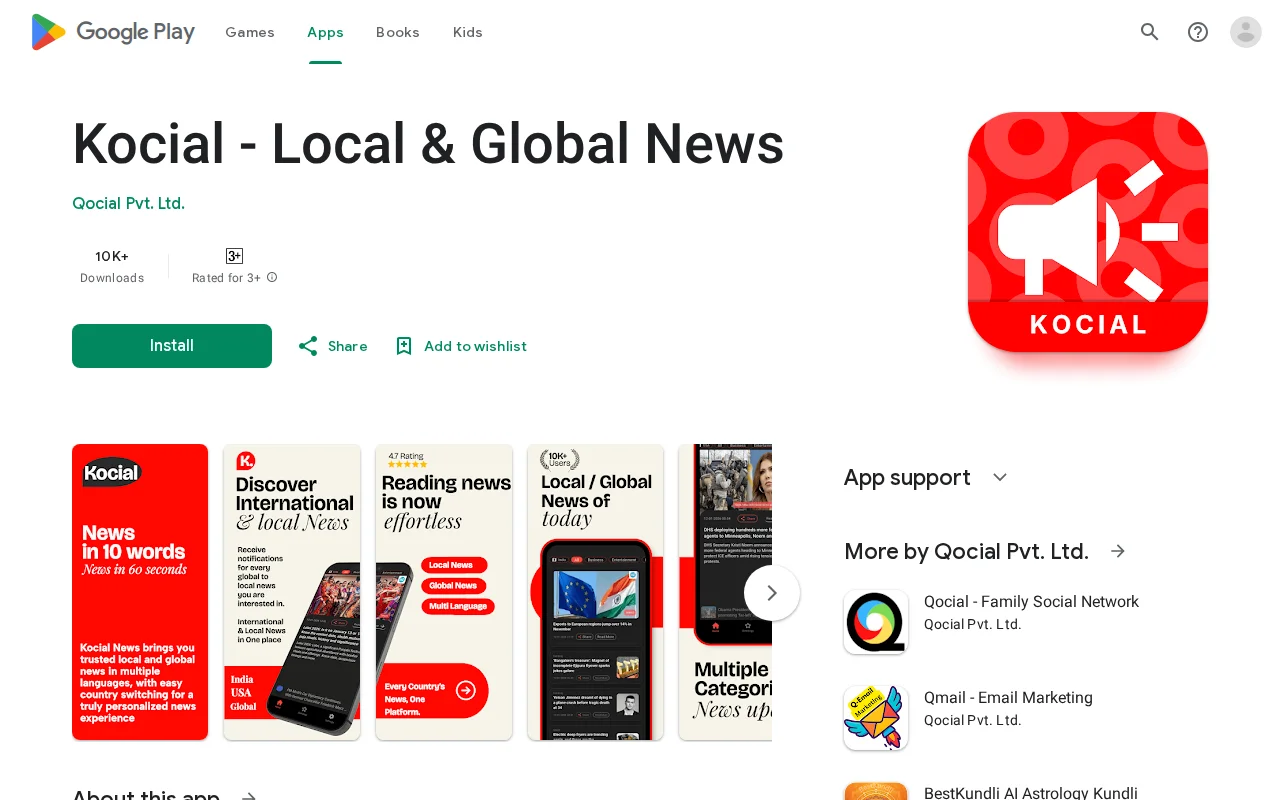
Ten-word news summaries feel more like a constraint than a feature versus InShorts.
General consumers, commuters
InShorts · Google News · SmartNews
World map of 13k headlines lets you browse news by country instead of feed.
Runs entirely client-side with a big, friendly UI and an explicit 'no tracking' promise, so you can type in your salary and immediately see 50 country equivalents. The interaction and typography make it addictive to poke around, but the site doesn't make the data source or methodology obvious (PPP vs market FX), so the results feel more illustrative than authoritative.
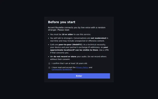
Themed Omegle clone for accent guessing, but WebRTC implementation is standard.
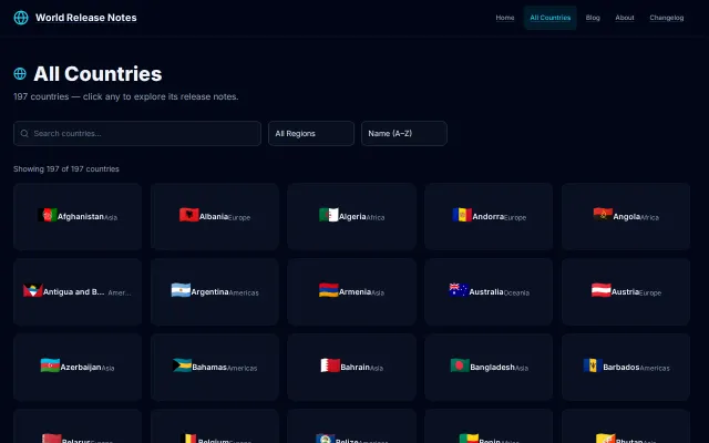
Clever 'release notes' framing for history, but lacks the depth of a real timeline tool.
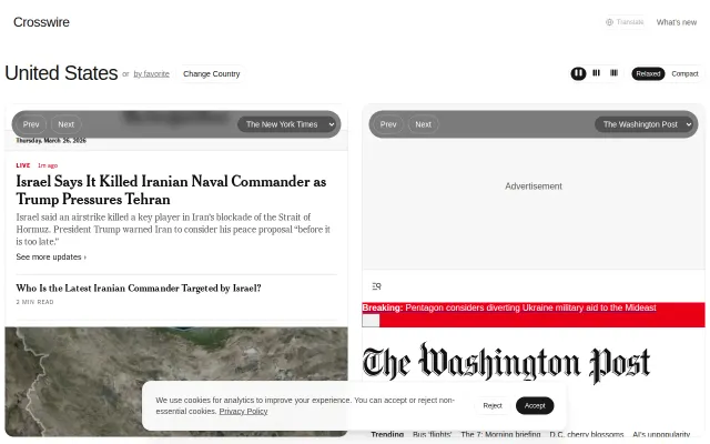
Ground News and AllSides already do media bias comparison with larger datasets.
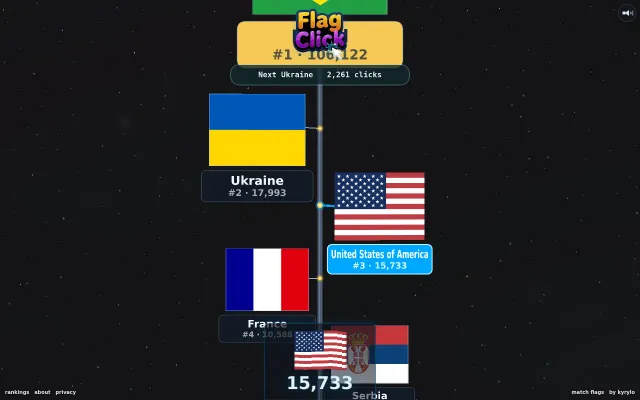
Simple country flag clicker with leaderboards, but no technical depth to discuss.