Developer Tools●Mid
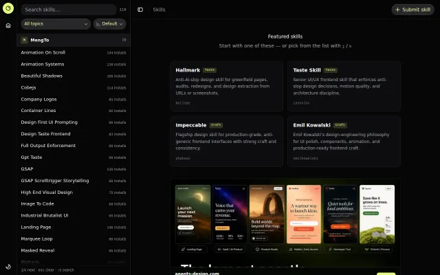
Design Skills Directory – curated agent skills for UI taste and craft
Useful curation, but just a list when agent marketplaces are emerging everywhere.
Niche Gem
tungtbt
203d ago
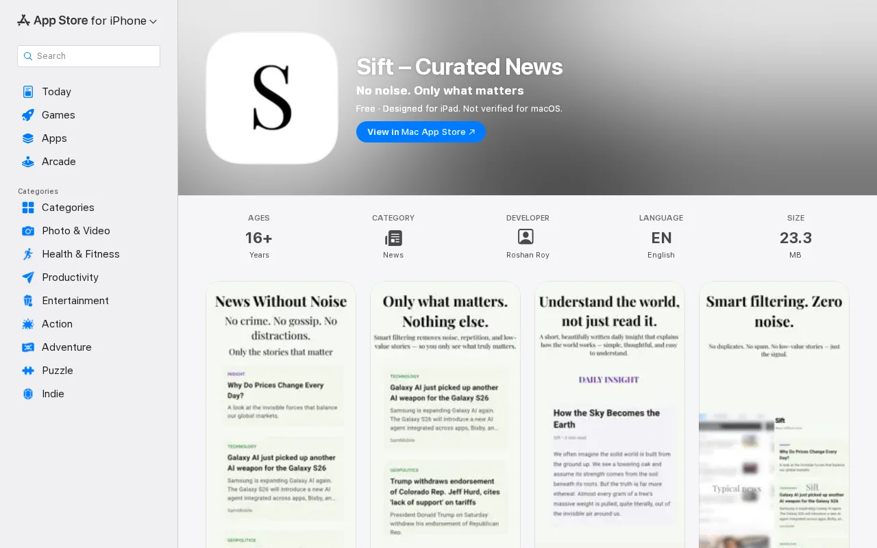
Yet another curated news reader when Apple News and Feedly already dominate this space.
iOS users who want a cleaner news reading experience
Apple News · Feedly · Inoreader
Looking for honest UI/UX feedback.
In screenshots the UI looks clean, but on real devices after installing it feels different — slightly dull / less crisp/ greyish. I can’t figure out if it’s colors, typography, spacing, or something else.
Would really appreciate direct feedback on:
what feels off or generic anything that reduces the “premium” feel
Also not sure if this could be due to display differences or iPhone settings.
Blunt feedback is welcome.
Useful curation, but just a list when agent marketplaces are emerging everywhere.
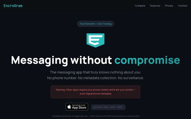
Starts from a strict threat model — password-only identities, no contact sync, ephemeral relays, and an emergency "0000" wipe all push toward leaving as little recoverable metadata as possible. Those are useful, concrete tradeoffs, but sweeping claims like 'technically impossible to spy' need a public audit and the Apple-only restriction limits reach and threat-model assumptions.
Yet another AI app directory when Product Hunt and existing platforms already do this.
Curated five-story newsletter for builders, but Morning Brew already dominates this space.
Arch-based distro with curated updates, but Kali, Parrot, and BlackArch already own this space.
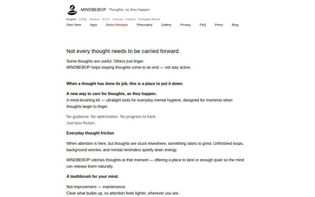
This ships thought-management as tiny, single-purpose 1MB apps — MindFlipOut for quick reframes, MindShoutOut to defer thoughts, MindZoneOut for a blank stillness screen, plus a time-based 'ease out' feature. The product's thesis is smart: reduce friction by making the tool vanish into the moment, not add another coaching layer. It's delightfully minimal and likely very usable for people who dislike bulky wellness apps, though the deliberately sparse approach will feel too thin for users wanting guidance or analytics.