Other●Mid
I rebuilt the $1M dollar homepage
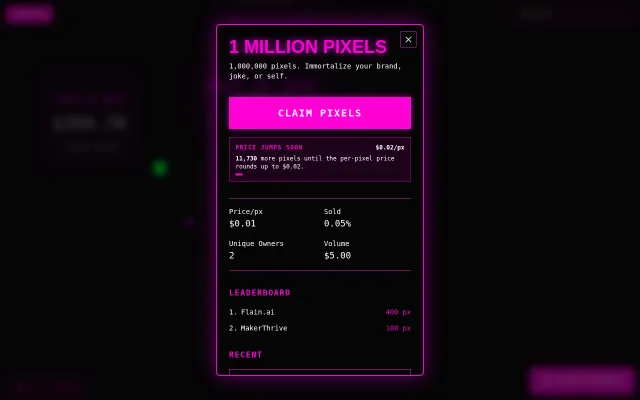
Nostalgic pixel marketplace with dynamic pricing, but the concept is 20 years old.
Niche Gem
westche2222
3115d ago
A pedantic recreation of the OMNI Magazine display typeface.
Researched 15 years of magazines to recreate OMNI's exact letterforms and hand-set kerning.
Designers, typography enthusiasts, retro computing fans, OMNI Magazine nostalgia seekers
Others have made similar typefaces, and I talk about how mine differs on the github README. At the end of the day, this is not "a font inspired by OMNI." It aims to BE the OMNI font.
Nostalgic pixel marketplace with dynamic pricing, but the concept is 20 years old.
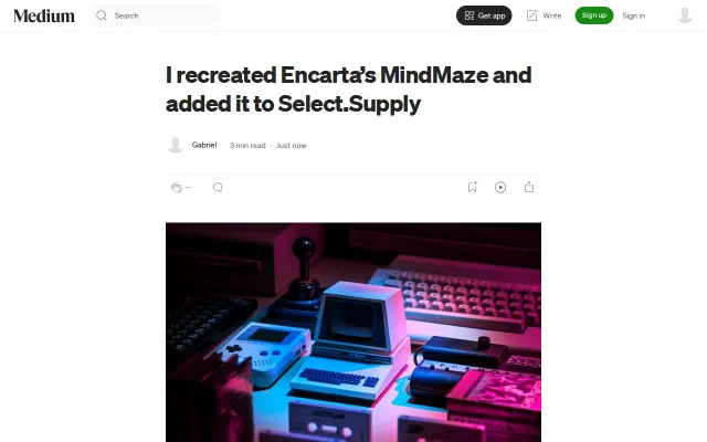
Faithful Encarta nostalgia that actually runs in modern browsers without plugins.
Browser-based Helbreath client recreation using Phaser 3 and React for hobby RPGs.
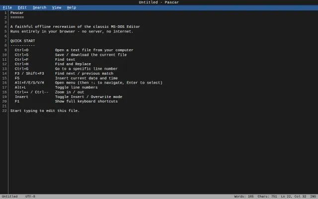
Pixel-perfect MS-DOS Editor clone that runs entirely offline in your browser tab.
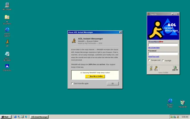
Full Windows 98 desktop with working AIM—real people are actually chatting in here.
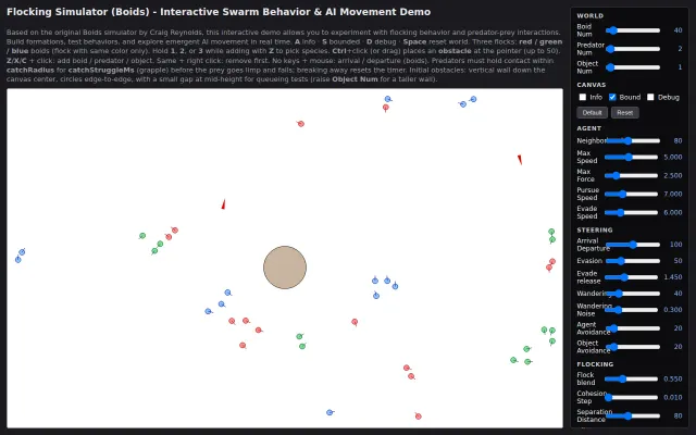
Deeply tunable boids simulation that visualizes emergent flocking behavior in real time.