Data●Mid
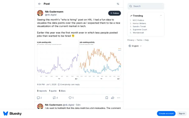
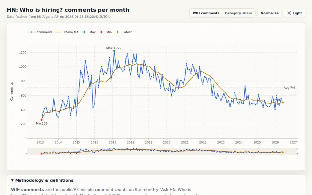
I visualized "Who's Hiring?" vs. "Who wants to be hired?" over time
HN hiring charts show the first month where seekers outnumbered posters.
Ship ItCozy
NikxDa
1028d ago
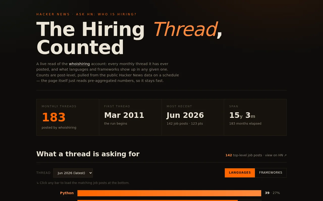
Fifteen-year trend visualization for HN hiring threads with pre-aggregated fast loads.
Hacker News users, job seekers, tech trend analysts
hntrends.com · hnhiring.me
I'm looking to add a bit more utilitarian functionality, a configurable monthly emailer, direct job links, etc, in the future. Hope you find useful.
HN hiring charts show the first month where seekers outnumbered posters.
Nice charts, but you could build this yourself with the Algolia API in an afternoon.
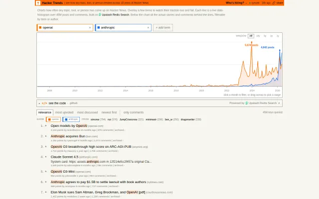
Google Trends for Hacker News lets you settle editor wars with 18 years of data.
Finally proves Rust has overtaken Java in HN hiring with hard numbers, not vibes.
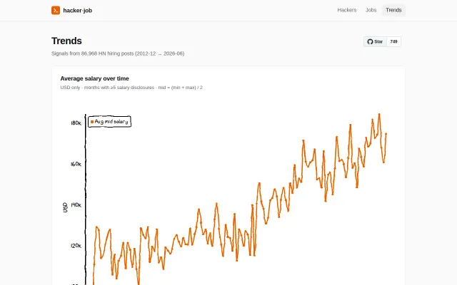
Interesting salary data visualization, but it's a static page with no tool substance.
60 years of metal data with regional breakdowns, but it's a visualization site without downloadable datasets or API.