Developer Tools●Mid
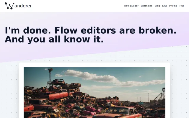
I'm done. Flow editors are broken. And you all know it
Rants about broken abstractions in n8n without shipping a working alternative yet.
Bold Bet
steampixel
302mo ago
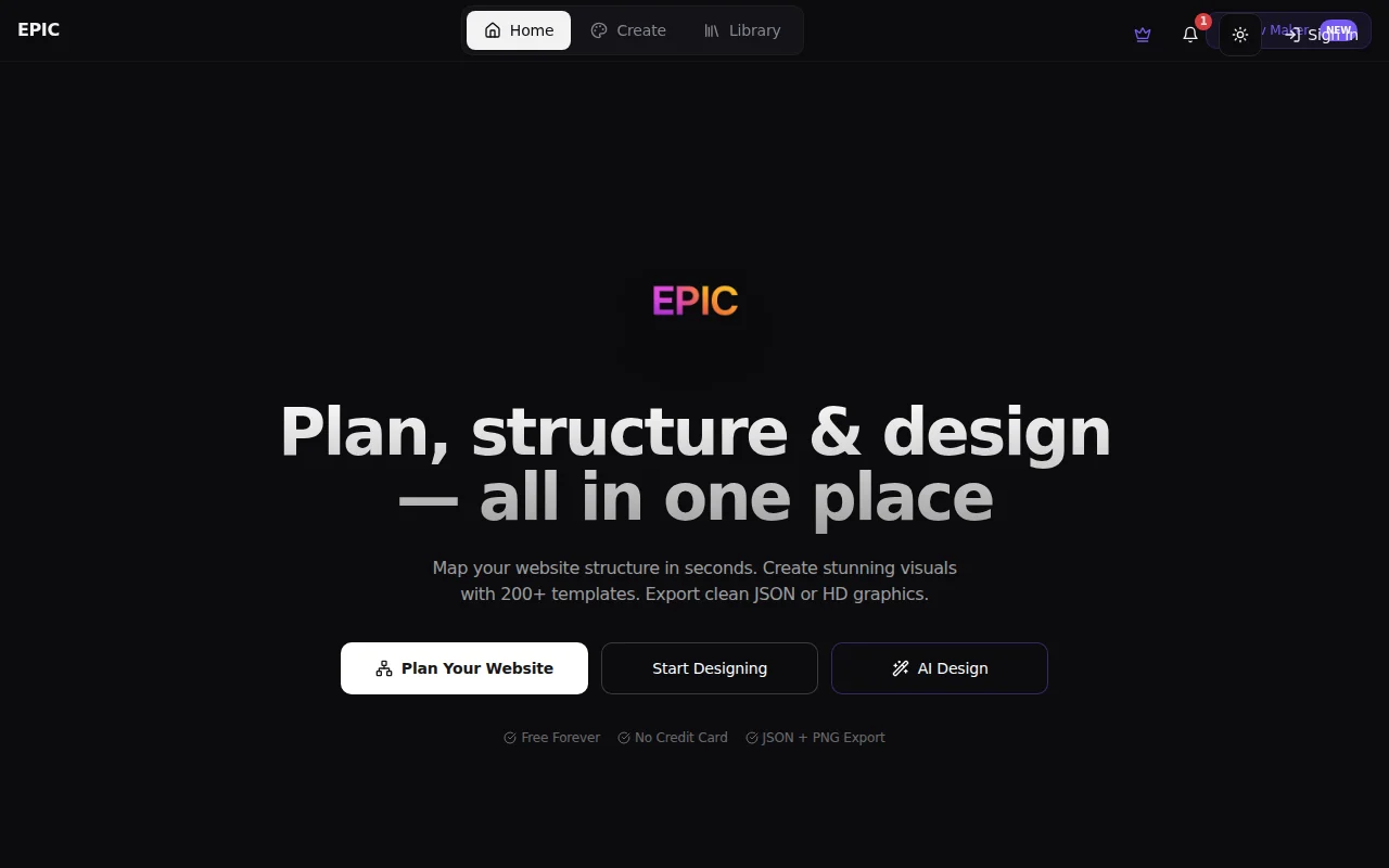
Canva clone with navigation planner; AI generation is table stakes now, differentiation unclear.
Creators, founders, students designing social media, websites, and marketing collateral without Figma/Canva expertise.
Canva · Figma · Adobe Express
Rants about broken abstractions in n8n without shipping a working alternative yet.
Video demo only — can't evaluate the actual agent implementation or substance.
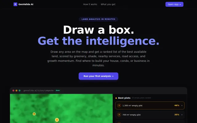
Satellite time-series analysis scores land potential while Zillow shows only static maps.
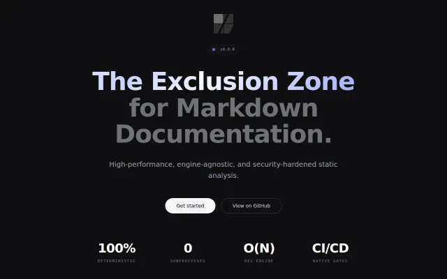
Markdown linter with credential scanning in code blocks, exits hard on security findings.
Eleven-page SaaS template, but it's a lead magnet for paid products.
SQL queries on CSVs with AlaSQL; remove.bg for spreadsheets, but actually useful.