Education●Mid
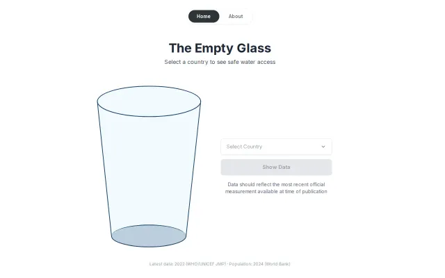
The Empty Glass – an interactive visualization of global water access
Glass metaphor makes water inequality visceral, but static data viz without interaction depth.
Eye CandyCozy
idowuinumimo
113mo ago
Maps traceroute hops visually, but Globalping already visualizes paths without the extra step.
Network engineers, system administrators, DevOps professionals
Globalping · MTR (My Traceroute) · BGPlay
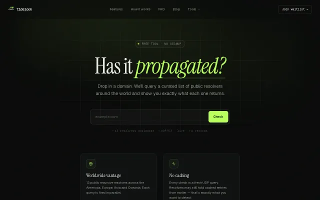
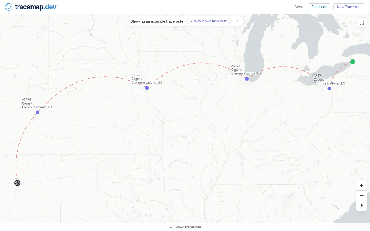
I thought it would be fun to plot a traceroute on a map to visually see the path packets take. I know this idea has been done before, but I still wanted to scratch that itch.
The first version just let you paste in a traceroute and it would plot the hops on a map. Later I discovered Globalping (https://globalping.io), which allows you to run traceroutes and MTRs from probes around the world, so I integrated that into the tool.
From playing around with it, I noticed a few interesting things:
• It's very easy to spot incorrect IP geolocation. If a hop shows 1–2 ms latency but appears to jump across continents, the geolocation is probably wrong.
• Suboptimal routing is sometimes much easier to notice visually than by just looking at latency numbers.
• Even with really good databases like IPinfo, IP geolocation is still not perfect, so parts of the path may occasionally be misleading.
Huge credit to the teams behind Globalping and IPinfo — Globalping for the measurement infrastructure and IPinfo for the geolocation data.
Feedback welcome.
Glass metaphor makes water inequality visceral, but static data viz without interaction depth.
Community-powered network testing API that rivals enterprise tools like ThousandEyes for free.
Pixel-perfect day/night terminator plus zero-latency map scrub without React renders.
Useful for quick DNS checks, but lacks the depth of established propagation tools.
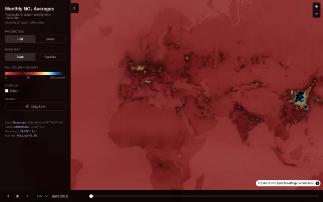
12-month rolling mean with time scrubbing reveals pollution patterns from 2019 to present.
Three.js renders real GPT-2 attention patterns you can actually explore interactively.