Data●●Solid
Micromort Risk Visualizer
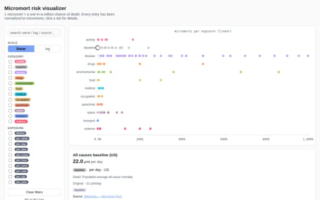
Sorting 487 risks by danger level is a genuine rabbit hole for the statistically anxious.
Rabbit HoleCozy
boxed
502mo ago
Combat-only focus is cleaner than Liveuamap, but data verification pipeline remains unclear.
Journalists, researchers, policy analysts following military conflicts
Liveuamap · ACLED · Crisis24
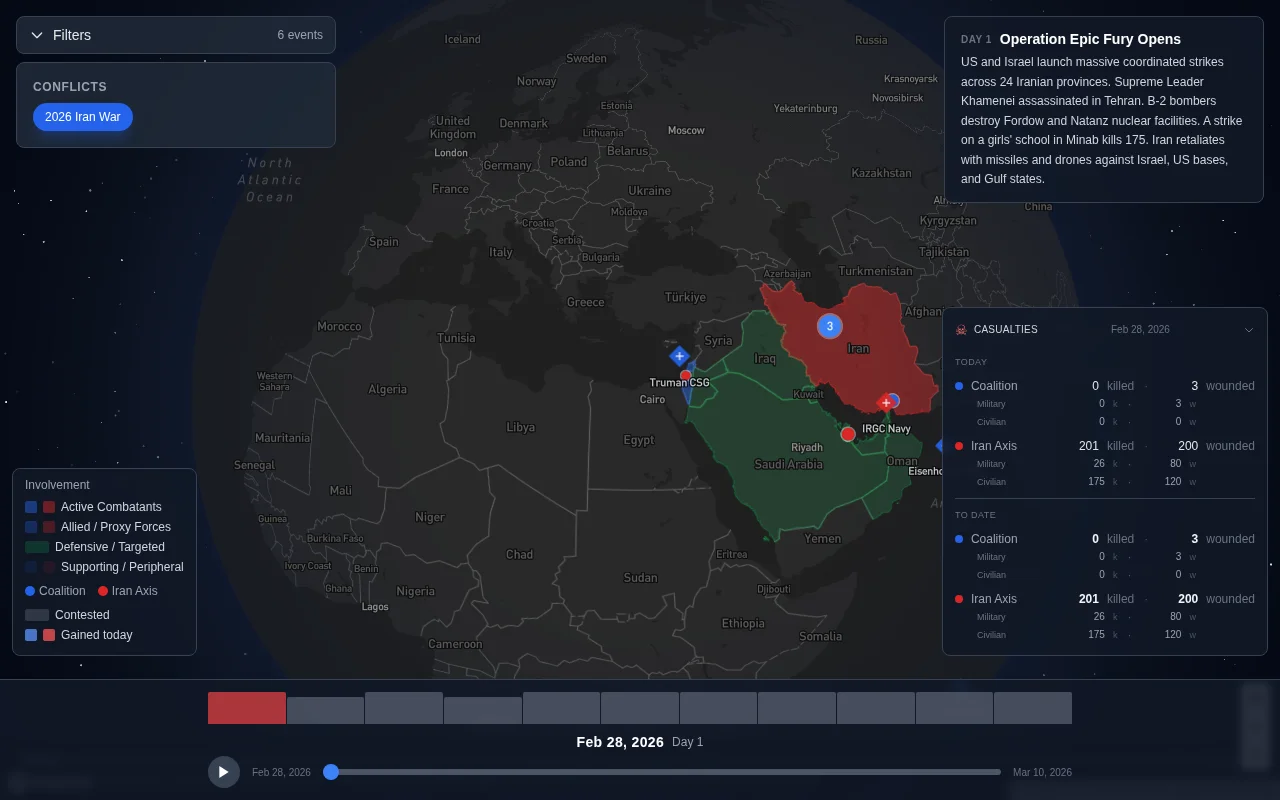
The closest thing to what I wanted is Liveuamap, but it has increasingly become a general news aggregator. The map includes protests, political statements, weather alerts, and unrelated incidents. There are also intrusive ads and the sources are often just reposted tweets without much verification or analysis.
I wanted something more focused. Specifically a map that only tracks combat events and shows the actual evidence when possible.
So I built Defogwar: https://www.defogwar.com/
It is an interactive Mapbox GL globe where military events such as airstrikes, drone strikes, artillery, ground assaults, and territorial changes are plotted geographically. Events are color coded by faction. There is a timeline slider so you can scrub through time and watch how things unfold day by day. Clicking a marker opens details about the event along with embedded video when footage exists.
The goal is simple: no political commentary pins, no news ticker spam, just combat events with sources.
The most interesting part technically ended up being the data pipeline.
Manually curating conflict events does not scale when you are one person, so I built an ingestion layer that pulls from RSS feeds and Telegram channels. The content is passed through Gemini 2.0 Flash which extracts structured fields such as coordinates, event type, factions involved, and severity. Everything then goes into a review queue.
Nothing goes live automatically. Every event still goes through manual review before it appears on the map.
The hardest problem has been filtering propaganda from the AI extraction step. A lot of the best footage actually originates from highly opinionated (or biased depending on your perspective) sources, which means the text surrounding it can contain language like “terrorist state” or exaggerated claims about damage. I often have to manually strip that language and normalize the description so the map remains factual.
Another challenge has been extracting reliable coordinates. Many posts reference places indirectly or only mention nearby towns. I ended up building a geocoding layer to resolve these into coordinates before review.
Current stack:
Next.js 14
PostgreSQL with PostGIS for spatial queries
Mapbox GL for the globe visualization
Cloudflare R2 for video storage (zero egress fees made this practical)
Railway for hosting
Right now the coverage is focused on the Iran conflict. I had other conflicts mapped earlier but temporarily removed them to focus on improving the data quality and pipeline first. Once the ingestion process is more reliable those will come back.
Long term I am also interested in mapping historical conflicts using the same timeline interface. I have found aggregators of historical events like WWII and the Vietnam War etc.
I would love feedback on the map UX. If anyone here works with OSINT data or knows good open sources for verified conflict reporting I would be very interested to hear about them.
*I helped with deployment and some UI refinement. My colleague did the heavy lifting on the engineering and data pipeline. He will be in the comments later. Thanks for considering this!
Sorting 487 risks by danger level is a genuine rabbit hole for the statistically anxious.
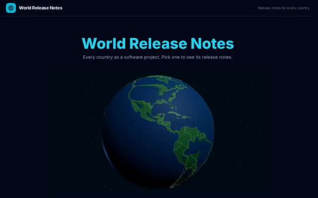
History as release notes is genuinely clever, but ultimately a visualization novelty.
Pretty globe, but Google Maps 3D, Mapbox, and Globe.gl demos already exist.
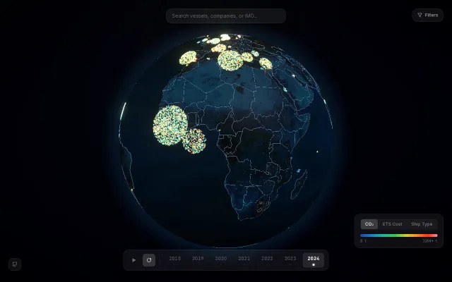
Gorgeous 3D emissions viz, but data exploration tools like THETIS already exist.
Globe visualization makes 23 tournaments feel explorable, not just listed.
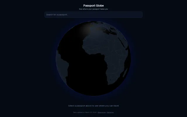
Pretty globe visualization, but visa data already exists on dozens of travel sites.