Data●●Solid
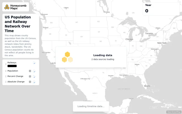
Animated map of US railroad and population growth
Watch rail networks explode 1850-1900 while population maps shift in real-time.
Rabbit HoleEye Candy
carstonh
205d ago
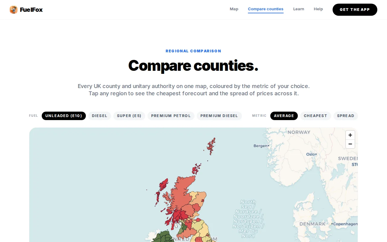
Clean map of UK fuel prices, but Google Maps and PetrolPrices already do this.
UK drivers and data journalists tracking fuel costs
PetrolPrices · Google Maps · Fuel Compare
The map aggregates the latest petrol and diesel prices by county, with filters for fuel type and metric. Clicking a county shows the cheapest forecourt, average price, spread, and station count. The feed covers roughly 8,000 UK forecourts and refreshes every 30 minutes. Retailers publish the prices, so there can still be gaps in the data/stations but it's getting better over time.
Watch rail networks explode 1850-1900 while population maps shift in real-time.
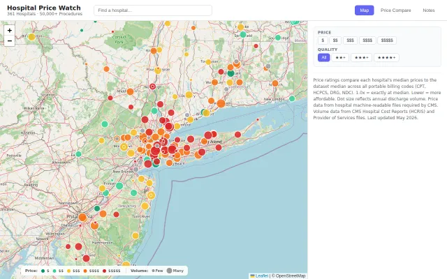
Turns opaque CMS machine-readable files into a shoppable map for hospital procedures.
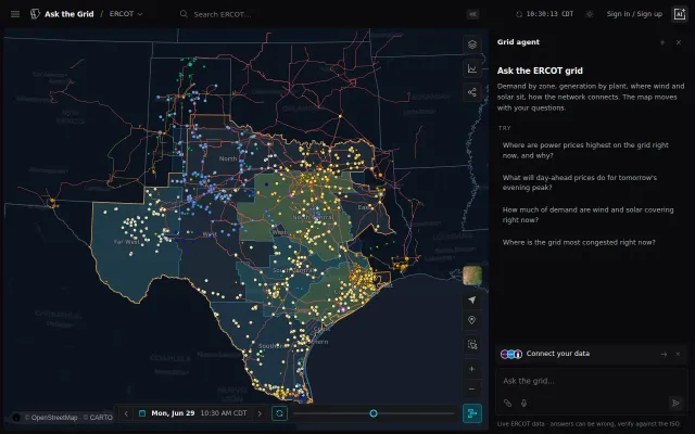
Live ERCOT data with natural language queries when most grid tools are static dashboards.
AI chat wrapper for event search when Eventbrite and Meetup already do this better.
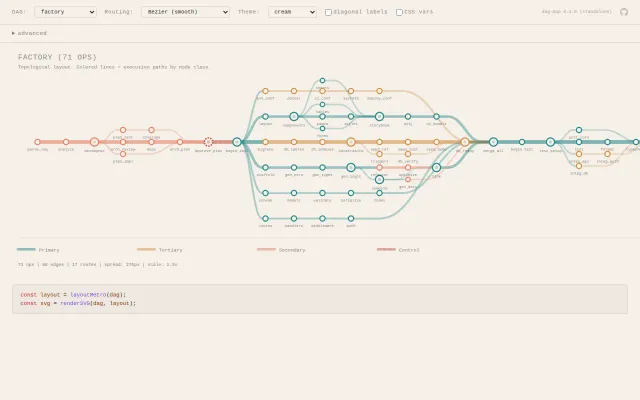
Metro map metaphor for DAGs is genuinely clever visualization nobody else does.
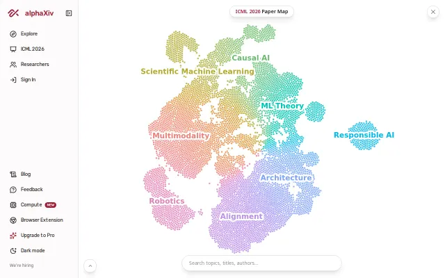
Clean paper visualization but Connected Papers and ResearchRabbit already do this better.