Data●Mid
CaliVibe – Explore California Neighbourhoods
California neighborhood map with crime and population layers, but AreaVibes already does this better.
CozyEye Candy
trekhleb
104mo ago
Watch rail networks explode 1850-1900 while population maps shift in real-time.
History enthusiasts, data visualization fans, educators
Gapminder · Tableau Public · Flourish
California neighborhood map with crime and population layers, but AreaVibes already does this better.
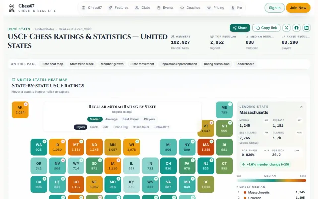
Texas beats California in active members; state medians vary wildly.
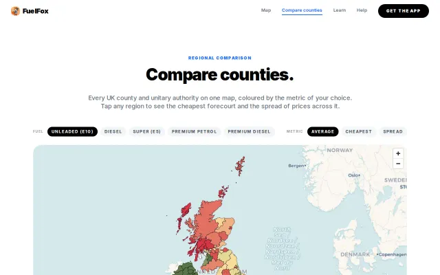
Clean map of UK fuel prices, but Google Maps and PetrolPrices already do this.
Finally, an animated visualization of kube-scheduler filter plugins that doesn't suck.
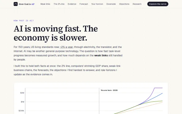
Well-made interactive essay, but the weak-link economics argument isn't novel.
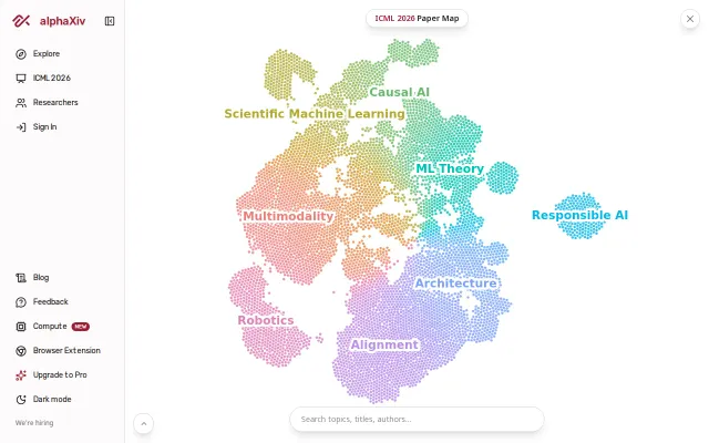
Clean paper visualization but Connected Papers and ResearchRabbit already do this better.