Developer Tools●●●Banger
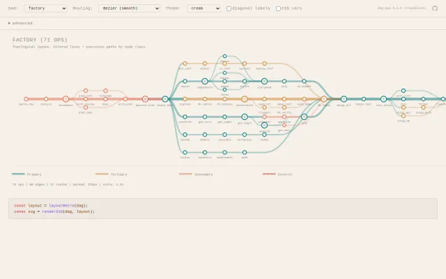
DAG-map – metro map visualization of a DAG
Metro map metaphor for DAGs is genuinely clever visualization nobody else does.
Big BrainEye CandyNiche Gem
pjettter
382mo ago

Heavy sci-fi branding obscures what is likely a standard LLM chain.
Strategic planners, founders, and project managers facing high-stakes decisions
Notion · Miro · Stratify
Metro map metaphor for DAGs is genuinely clever visualization nobody else does.
Primitive heaps beat FibonacciHeap by killing GC overhead in Java.
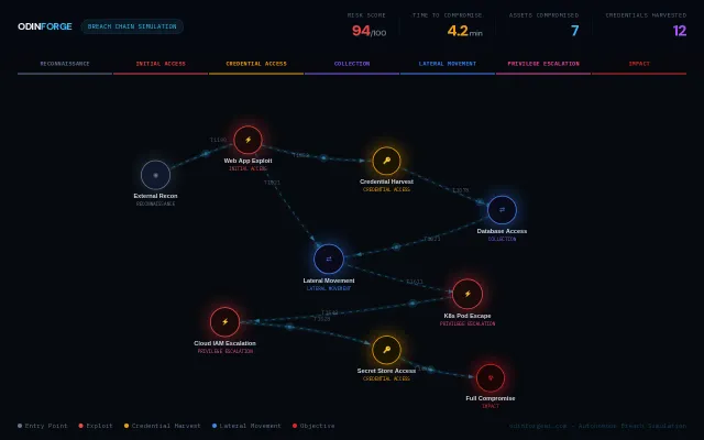
The UI turns complex attack chains into an immediately scannable graph with per-path metrics (risk score, time-to-compromise, assets/credentials impacted) — great for threat modeling and tabletop drills. Feels more like a very polished BAS visualization than a novel research tool; what I want to know next is where the simulation inputs come from (real telemetry, vulnerability feeds, or canned scenarios).
Visualizes pointer movement in trees for your code, unlike Python Tutor.
Shows attack paths through RBAC graphs when most scanners just flag misconfigurations.
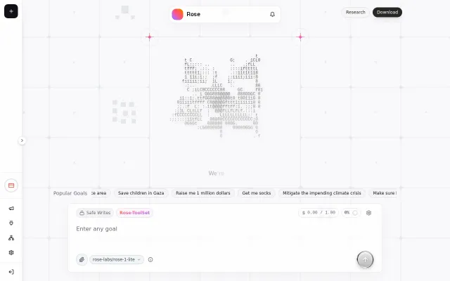
They've built a focused UI for launching goal-driven agent swarms and advertise three real pain points: integrations, stable decomposition, and long-running persistence — all the right battles to fight. The promise of spawning thousands of parallel agents and a harness that can persist multi-week runs is ambitious and useful if it actually works, but the landing page and sparse details leave key questions unanswered (cost controls, safety/guardrails, reproducibility, and evaluation metrics).