Data●●Solid
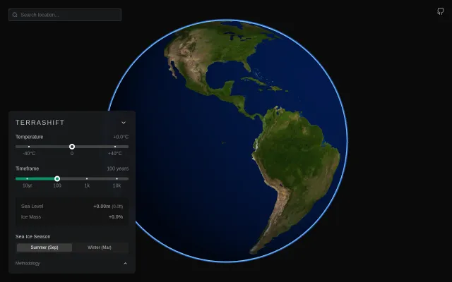
TerraShift: What does +2°C (or -20°C) look like on Earth?
Temperature slider drives real satellite data visualization better than static climate maps.
Eye CandyCozy
ttruett
514mo ago
![[Target: Calamity] A visualization of how long we have to change course](/screenshots/49118289.webp)
Haunting global risk countdown that visualizes tipping points better than any spreadsheet could.
Climate activists, data journalists, and concerned citizens
Climate TRACE · Doomsday Clock
It uses an AI-powered scanner to detect and evaluate these factors and synthesize them into a time remaining by anchoring published tipping-points and warping them by various factors.
This is a work-in-progress and should be taken with a grain of salt as-is. LLMs are imperfect and this is merely meant to be a proof-of-concept for a more accurate and complete system.
Let me know what you think!
Temperature slider drives real satellite data visualization better than static climate maps.
Pretty globe, but Google Maps 3D, Mapbox, and Globe.gl demos already exist.
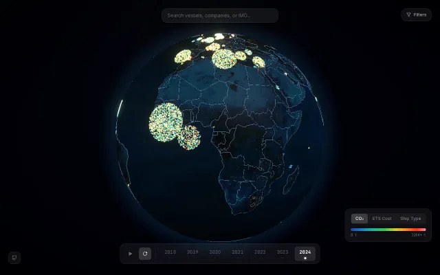
Gorgeous 3D emissions viz, but data exploration tools like THETIS already exist.
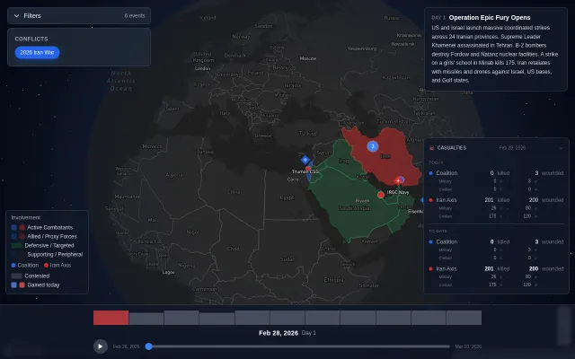
Combat-only focus is cleaner than Liveuamap, but data verification pipeline remains unclear.
Globe visualization makes 23 tournaments feel explorable, not just listed.
Yet another AI course generator when Khanmigo and countless tutors already exist.